Design Stages
- Audience:
- Graphic students
- Discussion on GESTALT:
- Gestalt claims that the whole is greater than the individual parts. Trying to find something that matched my name/initials was kind of hard. I began to develop a list of things that I liked and started sketching. I decided to create the shape of a C and cut out a part of the middle to create the V. In the end the logo ended up looking somewhat like a superhero logo.
- Summary:
- My symbol is reminds me of a superhero logo because of its structure. I decided on using a simple shape, but one that I still liked.
- "Bottom Line":
- In the end, I decided on using the letter C as the bigger shape and cut out a V shape to add some contrast. Designing the shape was easy but recreating it in Adobe Illustrator was a bit of a challenge.
Layout Stages
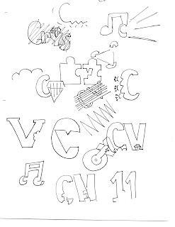
- Thumbnails: The initials that I used are CV. In this stage I brainstormed ideas and sketched them out to see if they would work. I struggled a bit at first because I had no idea what to draw so I started drawings things I liked. Eventually, I started to get the hang of using GESTALT logos. I also used google to understand GESTALT better by looking at example of well known GESTALT logos.

- Rough: For this stage I decided on the two logos that I felt were more GESTALT like. The first logo is of a letter C with a V on the inside to symbolize my initials. The second logo is of my favorite food pizza which has an obvious V shape to it. I then went in and made the pepperoni's the shape of the letter C to stand for Crystal.
- Comprehensive: In the end I decided on using the first logo from my roughs because it was the one that I felt worked best. After I decided on the shape I proceeded to scan it so that I could start working on it.
- Markup: To achieve a sharper logo I first started by uploading the scanned image to photoshop. I adjusted the levels and the hue and saturation. I saved the image as a PSD file for two reasons. One reason is so to make sure I can continue working on this file if I need to and so that I can open it in Adobe Illustrator to convert to a Vector. Once I opened the file in Illustrator I used the trace tool. I used the black and white logo trace but nothing really happened so I decided to use the pen tool. I started by using the pen tool to line the corners of the shape. Then I went around the letter with as little points as possible. To get the curves around the C I held down the shift key to readjust the lines created to match the curve of the shape. Once I was done outlining the shape, I changed the fill to black so that the shape would be complete. Finally, I saved the file as both an Ai and JPEG. I saved as an Ai to save my work and to have the best quality possible and saved as a JPEG for delivery to the blog.


No comments:
Post a Comment