Discussion: Trying to figure out the layout of where to place the images was very confusing at first. I had to rearrange the images several times until I got the hang of where they needed to be placed. I simply placed the images into the InDesign document and created a small text box underneath to describe the image process. Once I was done, I printed the booklet out and folded it to make it look like a little book.
Crystal's Graphics 101 blog
Thursday, December 3, 2015
My Type Figures Booklet
Goal: The Goal of this assignment was to design a booklet of our Type Figure designs. We were to create an 8.5 in by 11 in document divided into 8 squares.
Art Student Book Cover Collaboration
Discussion: My partner decided to cover the book New Moon by Stephanie Meyer. In the beginning, things were a bit unclear so we struggled to get our ideas flowing, but once we got the hang of things it was pretty easy to start putting things together. Hue designed the front of the book cover. Once she was ready, we scanned the image and opened it up in Photoshop. In photoshop I played around with the Hue and Saturation to make the colors of the image more defined. I then moved into InDesign, where I created the layout for the book. Once we figured out the exact measurements, it was pretty easy to go in and add all the extra bits that made the book come together.
Sunday, November 22, 2015
My Type Assignment
My Type 01
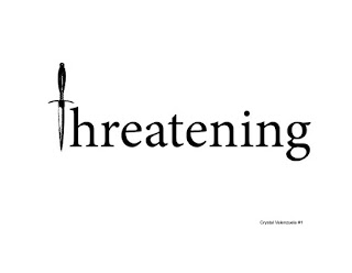
This illustration used the combination of type and a symbol to create an illustration. I created a text box and typed out the word threatening. I then selected the letter T and hit space to create an empty space where the T goes. Then I went over to photoshop and uploaded the picture of a knife and converted it to a bitmap image using 50% threshold. Then I placed the image in Indesign where the space for the letter T was and voila. The Knife now represents the letter T in threatening.
My Type 02
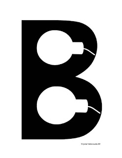
This illustration combined one letter and an overlapping symbol. I decided to use the letter B and bolded it. I then used the pen tool to fill in the white spots of the letter. I then opened the picture of a bomb into photoshop and used the magic wand tool to select the shape of it. I then inverted the selection and turned the bombs white. Finally I placed the picture into InDesign and resized the image (while holding down the shift key to keep the aspect ratio) to best fit the letter.
My Type 03
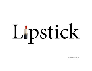
This illustration was similar to the first My Type assignment except that this one was in color. I decided to use the word lipstick and replaced the letter I with a red lipstick. This was very simple to do. All I did was Write out the word, created a space where the letter I was and placed the image of the lipstick in the space that I created.
My Type 04
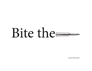
This illustration was also very simple to create. I wrote out the phrase "Bite the" and placed an image of a bullet to illustrate the saying "Bite the bullet."
My Type 05
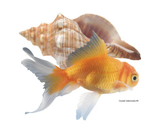
For this assignment I decided to use the images of a fish and shell to create the word shell fish, which is more of a pun then an actual word. I simply placed both images into Indesign and resized them to fit the 8x8 margin requirement.
My Type 06
This illustration incorporated an image that related to interacted with the text. I started out by opening the picture of a frame up in photoshop and deleting the background to make it transparent. I then placed the image in InDesign and created a text box inside of the frame to type the word "Framed." So the word Framed was literally framed.
My Type 07
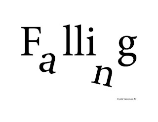
The final assignment was probably the easiest of all. I created a text box and typed out the word falling. I then selected the letters a and n and created a space. I then placed a new letter a and n in the empty spaces and rotated the text boxes to make it look like the letters where falling.
Layout Software:
I personally really enjoyed using InDesign. It was a little confusing trying to come up with the words and phrased but once I knew what I wanted to do, it didn't take long for me to figure out the software. The software basics are really easy to get the hang of but there are definitely some hidden tips and tricks that you have to learn to become a pro.
Type Figures using Adobe InDesign
Goal: The goal of this assignment was to get us used to using the Adobe program Indesign. We learned how to create letter forms and type figures to symbolize a word or to create an image.
Type Figure 01
Type Figure 01
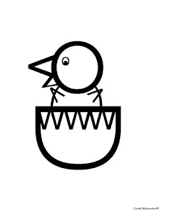
This type figure consists of creating an image out of letters and numbers. I started out by finding the perfect O font for the head. Then I used an upper case V and a lower case v to make the beak. I then went back and used a smaller O with a bold period for the eye. I used parenthesis for the body and two V letter for the wings. Lastly, I used the letter D as the shape of the egg because it was the only letter that I found to be similar to an egg shape. Letters U nor O worked for me. To finish off the hatching bird image, I used 3 W letters to add the cracked effect to the egg.

Type Figure 02
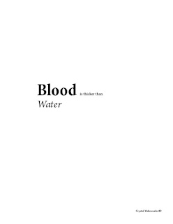
This type figure assignment consisted of using letter forms to actually spell out a related title or concept. I decided to use the phrase "Blood is thicker than Water." I bolded the word Blood and Italicized the word water to make the phrase literally look like what it says.
Type Figure 03
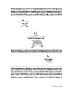
This type figure project consisted of creating a shape using letters, words, or phrases. This type figure took some getting used to for me. I started out by planning out what I wanted to do. Once I knew what it was, I started typing out a couple of sentences. I then copy and pasted the sentences a couple of times. I then used the pen tool to create a star shape and copy and pasted that shape 3 times. I then used the text wrap Wrap around text tool to wrap the sentences into the star shapes. I then inverted the text so that the sentences were inside of the stars instead of the stars being inside of the text.
Type Figure 04
This type figure assignment required us to create a sentence, illustration, or phrase and using an internet or text emoticon. I decided to use the sentence "You look excited today" followed by an excited emoticon. To create the emoticon, I created a new text box and typed out a colon : and capitalized D. Then I just rotated the text box so that the figures looked like an excited face.

Type Figure 05
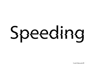
For this type figure we were supposed to create a form using text that is related to the idea. I started out by creating the text in photoshop to manipulate it. I wrote the word speeding and used the smudge tool to make it look like the word was speeding. Then I placed the images in InDesign, added my name to it and exported it.
Tuesday, November 17, 2015
Selecting Text in Adobe InDesign
Goal: The idea behind this assignment is to learn some of the tricks that Indesign has to offer for selecting certain areas of the text. These shortcuts make it easier and faster to work on projects.
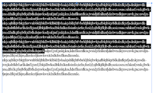
Clicks and Drag- selects the area you select.
1 click- places the cursor where you clicked.
2 clicks- highlights an entire word.
2 clicks and drag- selects the are you select word by word.
3 clicks- selects the row of words.
3 clicks and drag- selects the are you select line by line.
4 clicks- highlights the entire paragraph.
4 clicks and drag- highlights the area you select one paragraph at a time.
5 clicks- highlights the entire text.
5 clicks and drag- selects everything.
Thursday, November 5, 2015
Logo Design and Layout Stages
Design Stages
- Audience:
- Graphic students
- Discussion on GESTALT:
- Gestalt claims that the whole is greater than the individual parts. Trying to find something that matched my name/initials was kind of hard. I began to develop a list of things that I liked and started sketching. I decided to create the shape of a C and cut out a part of the middle to create the V. In the end the logo ended up looking somewhat like a superhero logo.
- Summary:
- My symbol is reminds me of a superhero logo because of its structure. I decided on using a simple shape, but one that I still liked.
- "Bottom Line":
- In the end, I decided on using the letter C as the bigger shape and cut out a V shape to add some contrast. Designing the shape was easy but recreating it in Adobe Illustrator was a bit of a challenge.
Layout Stages
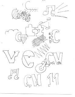
- Thumbnails: The initials that I used are CV. In this stage I brainstormed ideas and sketched them out to see if they would work. I struggled a bit at first because I had no idea what to draw so I started drawings things I liked. Eventually, I started to get the hang of using GESTALT logos. I also used google to understand GESTALT better by looking at example of well known GESTALT logos.
- Rough: For this stage I decided on the two logos that I felt were more GESTALT like. The first logo is of a letter C with a V on the inside to symbolize my initials. The second logo is of my favorite food pizza which has an obvious V shape to it. I then went in and made the pepperoni's the shape of the letter C to stand for Crystal.
- Comprehensive: In the end I decided on using the first logo from my roughs because it was the one that I felt worked best. After I decided on the shape I proceeded to scan it so that I could start working on it.
- Markup: To achieve a sharper logo I first started by uploading the scanned image to photoshop. I adjusted the levels and the hue and saturation. I saved the image as a PSD file for two reasons. One reason is so to make sure I can continue working on this file if I need to and so that I can open it in Adobe Illustrator to convert to a Vector. Once I opened the file in Illustrator I used the trace tool. I used the black and white logo trace but nothing really happened so I decided to use the pen tool. I started by using the pen tool to line the corners of the shape. Then I went around the letter with as little points as possible. To get the curves around the C I held down the shift key to readjust the lines created to match the curve of the shape. Once I was done outlining the shape, I changed the fill to black so that the shape would be complete. Finally, I saved the file as both an Ai and JPEG. I saved as an Ai to save my work and to have the best quality possible and saved as a JPEG for delivery to the blog.

Tuesday, October 20, 2015
Low Quality Raster LOGO Reconstruction in Vector Format
1. Preparation
In order to scan the image in the best possible quality I had to increase the resolution to 600. Although the higher the resolution the better, but for this case we only had to increase it to 600. The color mode that we had to scan it in was Grayscale because the image only has a few colors. Lastly, we had to adjust the scale to 100%. Once I scanned the image I simply cropped it down so that only the batman logo was in frame and saved it as a Tiff file.
2. Clean Up in Photoshop
I started off by rotating the image so that it was horizontal to the screen. Then I adjusted the levels to make the blacks darker and the whites whiter. This made the logo appear more defined and reduced some of the visible artifacts around the image. Next I changed the image size to 8400 while keeping the ratio of the image. Finally, I saved the image as both a PSD so that I can come back to it later and to transfer over to Illustrator, and as a JPEG for delivery to the blog.
3. Live Trace in Illustrator
Live trace, or image trace, is a visible solution. I wouldn't say that it works wonders but it definitely does the job. I used the Black and White Logo trace for this image since there were only two colors that I needed to be defined. I only needed to know the blacks from the whites in order for me to be able to properly select the areas that I needed.
4. Logo Reconstruction Using the PEN Tool in Illustrator
The PEN tool was very difficult to get the hang of. At first I couldn't get the pen tool to go in the direction that I wanted. Once I realized that the best way to get the pen tool to stay in a perfect oval shape is to hold down the shift key. I started off by placing a point at the top of the oval and holding down the shift key to get a perfect straight line. Then I made a second point at the bottom of the oval while holding down the shift key to get the curved line to be as close to the oval shape as possible. Finally, I connected the bottom point to the top point and readjusted the points with the direct select tool while holding down the option key. This process is used for the bat shape as well, but the bat shape takes more time because of all the curves around the wings. For the bat shape I had to add about 2-3 additional anchor points to make sure that the lines were curved enough to match the shape of the bat. It is very important to change the color of the stroke to a different color then the actual logo. I chose yellow because it contrasted from the black and allowed me to see what I was doing. Once I was done reshaping the lines I changed the stroke of the oval to black and the fill to yellow and the bat to black.
5. File Formats
When I scanned the image I used a tiff file because it is the best possible file so that the image isn't as compressed as if it was saved as a JPEG. Once I opened the image in photoshop I saved it as a PSD so that I wouldn't lose any of my work or quality. I also saved it as a JPEG so that I could deliver my cleaned up version to the blog. When I finished cleaning up the image, I moved over to Illustrator and saved the image as an Ai file once I was done working to save my work and exported as a JPEG to upload to the blog.
6. Advice on Vector Creation
When working on Vector images it is important to have a lot of patience. It may take a while to get the hang of working with all the points, especially if you are trying to outline a logo. I found this assignment to be quite difficult but once I got the hang of it I was able to finish the assignment properly.
Subscribe to:
Comments (Atom)


