Tuesday, October 13, 2015

Sony Increased Resolution Quality Comparison

"Raster RGB and INDEXED Increased Resolution Quality Comparison" 

Indexed Color 
Discussion: Saving as an indexed color gave this image terrible, terrible quality. Indexed color consists of only 256 colors or less. Compared to the RGB image which has 16.7 million colors to use the low number of colors gives the image lower quality. As you can see the image has a lot of artifacts around the edges, this was actually visible before it was compressed for delivery. 

RGB 
Discussion: I had some trouble with this image because I didn't get why it was just as terrible as the indexed image if saving as RGB was supposed to make it better. I realized that the issue was that I had changed the resolution size before changing the image to RGB. This makes a huge difference. You must first change the image to RGB and then increase the image resolution to 1000px. This will allow the image to resize in the best quality setting. As you can see, this image, compared the indexed color one above, the edges on this logo are much smoother. 


"High Quality RGB Converted to Vector" 

Discussion: What I did to achieve this image is that I changed the file to RGB and then increased the image resolution to 1,000px. After saving it, I opened it in Adobe Illustrator. I then changed the Image trace to high fidelity. Compared to the second image this image has much nicer quality and softer edges. 
Discussion: With the second image I did not change the resolution. I simply took the image and placed it in Adobe Illustrator. Then I changed it to High Fidelity but as you can see this image is very blurry and the edges aren't even rounded. 


Vector File Size Comparison

Simple
# of points: 7,648 (Low)
File Size: 2.2 MB
Image Trace: 3 Colors
Discussion: This image has a particularly smaller amount of points compared to the complex image. The image trace that I used on this image is 3 COLORS and Expanded it. Once it expanded I noticed that the points only aligned along the darker edges (shadows) of the image where there was a noticeable color difference. 

Complex
# of points: 90,705 (High)
File Size: 8.2 MB
Image Trace: High Fidelity
Discussion: This image had a high amount of points compared to the simple image. It contained 90,705 points. I used the High Fidelity image trace on this image so it had more color in it. The points attached to all the different color tones and values. There are so many points that you can't even see the picture once it is expanded. 

Line 
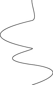
# of points: 2 (Low) 
File Size: 1.6 MB
Discussion: This image obviously contains a smaller amount of points because it is very simple. The line consists of two points, where the line begins and where the line ends. This image is actually of similar file size to the original file of the selfie, 1.6 MB.


Tuesday, October 6, 2015

Vector Logos

Apple Logo:
This logo was pretty easy to vectorize. In order to get the image to fit the file document I had to resize it by holding down the shift key to keep the proportions of the image. Then I went in and changed the image trace to High Fidelity because it has a gradient color effect. I found that High Fidelity was the best filter for this logo because it was the one that stayed true to the original logo while not losing any of the colors. 


Batman Logo:
This image was the easiest to image trace but it was the a bit difficult to resize to fit the file size. I flipped the image so that it would best fit the document and then resized it while holding down the shift key to keep it proportionate. The image trace that I used for this logo is 6 colors because the image only has two visible colors so it was still able to stay true to the original logo while being a smaller file size.  I also saved this file as a gif file because it provided the best quality for the image since it has a small amount of colors.


Firefox Logo: 
This image was the easiest to resize. I simply had to hold down the shift key as I resized to make sure that I kept the proportions of the original image. I used the High Fidelity Photo image trace because it was the only image trace that kept true to the original logo. Other image trace options lost most of the colors and others ruined the picture completely by only showing random lines. 


Sony Ericson: 
This image was the hardest to resize because the file size was really small. When you upscale the image to fit the document the quality is horrible. So I had to find the best image trace to reproduce the logo. I used the Low Fidelity photo image trace because it kept the image true to it's original colors and made the image much better quality. For example, when I selected the high fidelity image trace it made the edges of the logo look horrible. 

Pen Tool

Discussion: Personally I found this assignment to be quite challenging. Once I got the hang of it - it was easier to get through the assignment but I did encounter several obstacles while working.


Closed Geometric Rectangle:

How to: 
To get this shape you use the pen tool which you can see in the image provided above. Simply select four point on the document to create the rectangular shape. Make sure to connect all four dots exactly in order to completely close and create the shape, otherwise the pen tool will just keep adding additional points. 


Closed Curved Organic Shape:


How to: 
To create this shape use the pen tool to create a point somewhere on the document then release and move your mouse around to create your desired curve. Once you create the curve, create another point and repeat until you create the shape that you want. Remember to connect the dots in the end so that the shape will be closed and you won't end up with a million points everywhere. 


Straight Line:


How to:
To create a straight line use the pen tool to place the point somewhere on the document and drag the point to the desired length and create another point. Then connect the ending point to the point where you started so that the line will be created. Otherwise it will just keep adding points and the line will not be created. I found this shape to be the hardest to get the hang of. Once you have your line go to the window option at the top of the screen and make sure to select stroke. Make sure that you kept the point size at 1pt and then go down to where it says arrowhead and select the arrow that you like best.


Curved Line with a curved arrow:


How to: 
To create this shape start off by placing a point somewhere on the document. Then release, and move your mouse around to create the curved line (this is similar to what you did with the organic shape). Once you create your line go over to the stroke window and select the arrowhead that you like best.


Curved line with a different stroke:


How to:
Creating this shape is very similar to how you created the curved line shape. Start off by placing a point somewhere on the document. Then release, and move your mouse around to create the curved line that you desire (this is similar to what you did with the organic shape as well). Then go onto the stroke window and make sure that the point size is 3pt, turn on dashed line (you can mess around with the points), and then select the arrowheads that you like for both ends of the line.


Anchor: (Adding)


How To:
This particular technique took me a while to figure out but as soon as I realized what I had to do it was the easiest thing in the world! To add an anchor to an image simple use the (^) anchor point tool while holding down (Shift + C). This tool can be found under the pen tool option. 


Deleting an Anchor:


How to:
Deleting and anchor is similar to adding an anchor. Use the same anchor point tool but instead of dragging the shape outward to make an anchor, pull in inwards to remove the anchor.

Thursday, October 1, 2015

SHAPES in ADOBE ILLUSTRATOR


Goal:
The goal of this assignment is to learn the basics of creating shapes using illustrator. We were able to create different shapes using the already existing shape tools. For example, you can create multiple sided shapes using the polygon and star tools by just clicking on an area of the document so that the option window pops so that you can adjust the number of sides. You can also create perfect shapes, such as a square and circle by using the rectangle and elliptical tool and holding down the shift key.

Wednesday, September 30, 2015

Raster and Vector

Discussion:
Originally you start off with a raster image in photoshop. Photoshop works with pixels. For example if you draw a line on an image and zoom in you will notice that the line consists of pixels. So you have basically just created another image on top of the already existing image. When you convert to vector in illustrator you are now working with lines. Every point on an image basically becomes it's own and you can use this to morph and change a picture however you wish.

What is Raster:
Is and image made up of pixels. This is also known as bitmap.

What is Vector:
Is an image that is not made up of pixels, just lines.

Process:
I started out with using my selfie and opening it in photoshop. After saving the file as a psd (to make sure that I do not lose any of my work) I messed around with the Saturation and Levels of the image. I saved my work then continued on over to illustrator. I opened the image in illustrator by opening a new 8.5 x 11 file and dragging my picture in to fit the file as best as I could. Then I messed around with the image trace tool. I repeated the same steps 3 times to get 3 different images. Finally I used one of my already existing images and used the image trace tool to give it the 3 colors effect. I then expanded the image and selected the areas that I wanted to fill in. Once I did that (and made sure that I saved my work) I used the direct select tool to modify different points of the image by stretching them to reshape my face. In the end I ended up with a crown like the one on the statue of Liberty.

Low Fidelity Photo

Black and White Logo

High Fidelity Photo

Color Fill

Modified Points


Thursday, September 24, 2015

Clone Tool

Goal: 
The goal of this assignment was to mess around with the clone in order to learn what it can do. 

Discussion:
This is the image that resulted from using the clone tool. I selected my eyes individually by holding down he option key and selecting the area that I wanted. I then pasted it onto my cheeks and clicked and dragged on top of the selection to clean it up a bit. I then went on to repeat the same steps for my other eye and my lips. 


Clone Tool:
The clone tool can be used to select one area of the image to replace another area. This can be used to fix certain areas of an image for practical use, but can be used to also mess up the image entirely for a fun effect. 

Brush Size: 
Depending on the area that you want to select you can increase or decrease the brush size to best fit the size of the area that you want to select.