Wednesday, September 30, 2015

Raster and Vector

Discussion:
Originally you start off with a raster image in photoshop. Photoshop works with pixels. For example if you draw a line on an image and zoom in you will notice that the line consists of pixels. So you have basically just created another image on top of the already existing image. When you convert to vector in illustrator you are now working with lines. Every point on an image basically becomes it's own and you can use this to morph and change a picture however you wish.

What is Raster:
Is and image made up of pixels. This is also known as bitmap.

What is Vector:
Is an image that is not made up of pixels, just lines.

Process:
I started out with using my selfie and opening it in photoshop. After saving the file as a psd (to make sure that I do not lose any of my work) I messed around with the Saturation and Levels of the image. I saved my work then continued on over to illustrator. I opened the image in illustrator by opening a new 8.5 x 11 file and dragging my picture in to fit the file as best as I could. Then I messed around with the image trace tool. I repeated the same steps 3 times to get 3 different images. Finally I used one of my already existing images and used the image trace tool to give it the 3 colors effect. I then expanded the image and selected the areas that I wanted to fill in. Once I did that (and made sure that I saved my work) I used the direct select tool to modify different points of the image by stretching them to reshape my face. In the end I ended up with a crown like the one on the statue of Liberty.

Low Fidelity Photo

Black and White Logo

High Fidelity Photo

Color Fill

Modified Points


Thursday, September 24, 2015

Clone Tool

Goal: 
The goal of this assignment was to mess around with the clone in order to learn what it can do. 

Discussion:
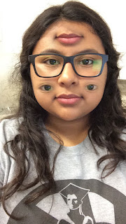
This is the image that resulted from using the clone tool. I selected my eyes individually by holding down he option key and selecting the area that I wanted. I then pasted it onto my cheeks and clicked and dragged on top of the selection to clean it up a bit. I then went on to repeat the same steps for my other eye and my lips. 


Clone Tool:
The clone tool can be used to select one area of the image to replace another area. This can be used to fix certain areas of an image for practical use, but can be used to also mess up the image entirely for a fun effect. 

Brush Size: 
Depending on the area that you want to select you can increase or decrease the brush size to best fit the size of the area that you want to select.

Liquify Filter


Goal: The goal of this assignment was to learn the basics of using photoshop tools. In this assignment we worked with the Liquify Filter to completely transform our images. 

Discussion:
This is the image that resulted from the use of the tools in the liquify filter. I pulled the edges of my hair forward to give it a weird hairstyle with the forward warp tool, made my eyes bigger using the bloat tool, and shrunk the bottom half of my face with the pucker tool.

Steps: 
I started off by using the Pucker Tool to shrink my entire face. I then went in with the Reconstruct Tool and fixed the sides of the image, which were pulled in too far by the Pucker tool. This also gave me the effect of a smaller chin and lip area because originally the image shrunk my entire face. Next I used the Bloat Tool to make my eyes bigger. Finally I went in with the Forward Warp Tool to warp my hair into a weird style. 

Pucker Tool
This tool shrinks certain areas of the image by pushing the pixels towards the center of the brush tool. 

Forward Warp Tool
This tool warps images when you drag and click on a certain area by pushing the pixels forward. Depending on the brush size you can control the amount of pixels that are being pushed. 


Bloat Tool

This tool pushes pixels away from the center of the brush tool to make the selected area look inflated.


Reconstruct Tool
This tool is used to go through and fix any accidental distorting of the image when you were using the other tools.


FILTERS

Part of this assignment required us to work with and utilize the different filters  in photoshop.

Fresco:
The fresco filter gives the image a sort of water color painting effect. It makes the colors in the image appear really rich, especially the blacks. 


Plaster:
The plaster filter outlines the darker parts of the image; like the blacks, to create an outline of the image and removing all of the other colors. This also gives the image a smooth texture. The bad thing about this filter is that it removes a lot of the original content of the image. 


Stained Glass:
The stained glass filter gives the image a mosaic effect. 


GIF Colors and Quality

What is Indexed Color? 
Indexed color reduces the number of colors that are being used to make the image smaller in size which is generally used for uploading to the web. Indexed color consists of 256 colors or less (8-bit). 

6 Colors
Size: 12 KB
Quality Observation: This image uses only 6 colors. In comparison to the image below it is noticeable that this image has less colors, only utilizing blacks, grey, browns, whites, and such. 


200 Colors
Size: 41 KB 
Quality Observation: This image utilizes 200 colors. As you can see this image now has pinks, greens, and different color shades. This image is also much bigger in size since it uses more colors. 

JPEG Compression an FIle Size

Goal: The goal of this assignment was to play around with the image quality by changing it from 100 to 60 to 0. Once you open up the new images that were created the quality is noticeably worse each time the quality was lessened. 

How I achieved this: 
First we had to save the JPEG as a PSD to make sure that we have a back up file in case we make a mistake and need to revert to the original image. Once we had the file open in photoshop we were to go to filter gallery and add the cutout filter. Then we had to adjust the image size of the picture to equal ~350 kb. Finally we were to go in and "save to web" and change the quality to 100, 60, and 0.

JPEG (Original Image)
Image Size: 2.08M
Quality Observation: The original file is much better quality then the rest of the image because it has not been compressed or changed. The file size is in Megabytes where as the other images are reduced to Kilobytes. 
Q:100
File Size: 82 KB on disk
Quality Observation: This image has the better quality out of the three. This image is not as compressed as the rest because the file size is not as bad. Once you zoom in, you can start to see where some of the image quality is lost. 
Q:60
File Size: 29 KB on disk
Quality Observation: The Quality of this image does not look bad, but once you zoom in you can start to notice the difference between the 100 and 60 quality difference. The file is becoming more and more compressed which is what is resulting in the bad quality of the image.
Q:0
File Size: 12 KB on disk
Quality Observation: The quality of 0 made this image look just as it suggests, horrible. The number of pixels remain but the image quality itself worsened. The image is really fuzzy. As you can see from the last image, this image size is down by about half which is why this image is much, much worse.


Wednesday, September 16, 2015

Layers and Compositing


Goal:
The goal of this assignment was to make the images we selected transparent so that we could paste them onto a new document. We were then to overlap the images onto each other creating some sort of  a story.

Commentary:
I personally found this assignment to be particularly easy because I have worked with photoshop before. It has been a while since I last used it, so it was a bit of a challenge to remember certain techniques but I was able to follow through with the assignment. The image of the sheep was the hardest to make because unlike all of the other images the background for this one wasn't white. Since the background had color it was harder to select the color values with just the magic wand so I had to go back in with the lasso and magnetic lasso tool to get the areas that weren't selected the first time. This assignment taught me how to make images transparent, which is something I did not know how to do.

Story:
I'll be honest, I don't think there is much to tell about my image but what I tried to do with the frame, thumbtack, flower and sheep was create a portrait. The flower is the design on the frame. The sheep is the actual image and the thumbtack is holding the photo up.

Thursday, September 10, 2015

Selection Tools


Rectangular Marquee Tool

This tool selects certain areas of an image in perfect square or rectangular shapes. To get a perfect square shape simply hold down the shift key as you make the shape so that it will keep the proportions of equal sides.


Elliptical Marquee Tool

This tool selects an areas of the image in perfect circle and oval (elliptical) shapes. To create a perfect circular shape hold down the shift key while using the elliptical tool to create the shape.


Lasso Tool

This tool is known as a free hand tool because it allows you to select any area freely.


Magnetic Lasso Tool

This tool is similar to the lasso tool but attaches to the similar color values in the image for a more precise selection.


Magic Wand Tool

This tool attaches to similar tones and color values for a more precise selection.


Tolerance
The amount of value that it will select, high or low.

Feathering
softening the edges of the selection

Contiguous
touching

Anti-Aliasing
Smoothing

Screen Shot Key Combinations:

Command shift 3
saves photo to desktop and screen shots the entire screen.

Command shift 4
screen shots a specific area that you've chosen/selected.

Command shift 4 - the hit space
Selects floating windows; gives a perfect screen shot.

Tuesday, September 8, 2015

Semiotics Logo


Logo discussion
This logo consists of black bold letters that read amazon. Amazon is a an internet based retailer in the United States.

Symbols
The specific symbol in this logo is both an arrow and a smile. 

Origin of symbols
The symbol originally started off as an image of the a river descending on the letter A. The logo was then changed to an arrow and smiley face that starts under the a and ends on the z, creating a dimple. The founders found that it better represented what the sold and their guarantee to ship anywhere which results in customer satisfaction.

Meaning of symbols
The arrow symbol under the words amazon symbolize their endless inventory of anything from a to z. The arrow then turns into a smile which represents customer satisfaction.

Semiotic categories

Iconic: The amazon logo is iconic because the sign looks exactly like what it is representing. The              arrow is usually understood by everyone and known that it represents from one end to another. 

Indexical: The logo is indexical because the arrow turns into a smile to show customer satisfaction. This is a cause of amazons a to z inventory, which guarantee's that they have something for everyone. It also is a cause of the world wide shipping which we all know is a customer satisfaction. 

Symbolic: The logo is symbolic because it may not be known by everyone. First they must learn what the logo is in order to know that it represents the online retailer, amazon. 


Tuesday, September 1, 2015

SEMIOTICS

Semiotics: The study or science of signs.

3 Categories of Semiotics:
    1. Iconic
    2. Indexical
    3. Symbolic

This image of a handicap symbol is both iconic and symbolic because the half circle represents the wheelchair and the figure is iconic of a person.
Iconic is something that looks like what it is representing. Symbolic is something that has to be learned and Indexical is something that is causative, meaning that one thing causes another thing to happen.